
Blog
August 17, 2026
·8 min read3D Product Viewer Accessibility: A WCAG Testing Checklist

Otuokon Nsikak
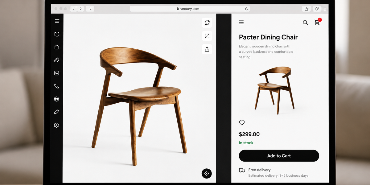
An accessible 3D product viewer needs more than an image description. The complete product-page experience should let people identify the viewer, reach and operate its controls with supported input methods, understand visible changes, access equivalent product information outside the 3D scene, and continue the buying journey without becoming trapped in the interactive area.
For ecommerce, web, product, accessibility, and quality teams, the practical goal is not to label a viewer accessible in isolation. It is to test the published page against the buyer tasks, devices, assistive technologies, and WCAG criteria that apply to the organisation.
This checklist helps a team define that acceptance evidence before a pilot moves into a wider catalogue rollout.
Start with the buyer task, not the viewer controls
Write down why the 3D viewer is on the page. A buyer might need to inspect the back of a product, compare an approved material, understand how components relate, or view an item in spatial context. That task determines which information and interactions are essential.
Record:
- the product and approved revision;
- the buyer question the viewer should answer;
- the essential product facts shown in or around the experience;
- the devices, browsers, and assistive technologies in scope;
- the team responsible for the model, page, accessibility review, and release; and
- the evidence required for approval.
If the purpose is unclear, the team cannot judge whether a text alternative, keyboard route, or fallback provides an equivalent result.
Give the interactive experience a clear name and purpose
People should be able to identify the 3D experience before entering it. The surrounding heading and accessible name should explain both the product and the purpose, such as “Interactive 3D view of the adjustable office chair.” Avoid labels such as “viewer,” “image,” or a file name without context.
W3C guidance for non-text content requires a text alternative that serves the equivalent purpose. Its guidance for user interface component names, roles, and values also requires names and roles to be programmatically determinable, with relevant states and values available to assistive technologies.
Test the published page with a screen reader or accessibility inspection tool. Confirm that the viewer container and each control are announced with meaningful names, that repeated controls are distinguishable, and that state changes such as selected material or expanded hotspot are exposed where the implementation supports them.
Keep essential product information outside the 3D scene
A 3D model can support understanding, but it should not become the only source for a specification, option, warning, instruction, price, availability state, or purchase decision.
Provide essential information as structured page content. Depending on the product, this may include:
- dimensions and units;
- available materials and finishes;
- included and excluded components;
- compatibility and installation requirements;
- safety information approved for the page;
- variation names and availability; and
- a useful fallback image or gallery.
The text does not need to narrate every visual detail. It should provide the information required to complete the buyer task when the interactive route is unavailable, difficult to perceive, or unsuitable for a user’s input method.
Test every essential action with a keyboard
WCAG 2.1.1 keyboard guidance states that content functionality should be operable through a keyboard interface, apart from limited path-dependent exceptions. For a product page, the acceptance test should cover the full route rather than one isolated button.
Starting before the viewer, use only the keyboard to:
- move focus to the experience;
- start or activate it if activation is required;
- reach each essential control in a logical order;
- rotate, zoom, reset, or select an equivalent controlled view where those actions are essential;
- open and close hotspots or information panels;
- leave the viewer without a keyboard trap; and
- continue to product options, add-to-cart, and the next page control.
Document the keys used and make instructions discoverable. If an action cannot be completed, record whether the issue belongs to the viewer, the embed, the surrounding page, a theme script, or another integration layer.
Provide an alternative to drag-only operation
Many 3D viewers use dragging to rotate the model. WCAG 2.2 guidance on dragging movements requires functionality using drag gestures to have a single-pointer alternative without dragging, unless dragging is essential.
Test whether a buyer can achieve the same useful result through controls such as left and right rotation buttons, preset views, a part list, or another single-pointer action. The alternative does not have to reproduce every free-form camera position. It needs to provide an equivalent way to complete the intended task.
Keyboard operation remains a separate check. Passing the single-pointer alternative does not by itself prove that the experience works from a keyboard.
Make focus visible and the route predictable
A sighted keyboard user should always be able to see which control has focus. W3C focus-visible guidance says a keyboard-operable interface needs a mode where the focus indicator is visible.
Check:
- the focus indicator is visible against light, dark, and image backgrounds;
- focus order follows the visual and task order;
- focus does not jump unexpectedly when the model loads;
- opening a panel moves focus only when that behaviour is intentional;
- closing a panel returns focus to a sensible control; and
- sticky headers, cookie banners, or overlays do not hide the focused element.
Run this test on the real product template. The embed may behave differently when combined with store navigation, galleries, consent tools, or page-builder components.
Check controls, instructions, and changing states
Icon-only controls need meaningful accessible names. Selected states, expanded panels, disabled options, loading messages, and errors need to be available in a form that users can perceive.
Review common viewer actions such as reset view, full screen, zoom, AR launch, hotspot selection, and variation choice. Confirm that the visible label, accessible name, role, and current state agree. Do not rely on colour alone to show which finish or option is selected.
If a material or component change affects the sellable product, verify that the same selection is reflected in the product-page text and order controls. A visual change inside the model must not imply that price, stock, or the basket changed unless the implementation actually updates those systems.
Test touch, zoom, motion, and responsive layouts
The current SwiftXR 3D model viewer is designed for browser embedding and supports rotate and zoom interactions across desktop and mobile contexts. That product capability still needs destination-page testing.
On representative phones, tablets, and desktop devices, check that:
- touch targets are large enough for the organisation’s accessibility standard;
- the experience does not block page scrolling unexpectedly;
- browser zoom and text resizing do not hide essential controls;
- orientation changes do not remove access to the viewer or fallback;
- automatic motion can be paused or avoided where the experience uses it;
- essential instructions do not depend on hover alone; and
- a useful non-interactive route remains available when 3D or AR cannot run.
Do not assume that a successful desktop mouse test covers touch, switch, keyboard, magnification, or screen-reader use.
Validate the complete purchase path
Accessibility acceptance should include the route before and after the 3D experience. A technically operable viewer can still create a barrier if it pushes product information out of order, traps focus, obscures variations, or interrupts checkout controls.
Test at least one simple product and one representative variation flow when those product types are in scope. Confirm that product selection, price, availability, add-to-cart, cart updates, and checkout continue to work after interacting with the viewer.
Include failure conditions. Block the model request, slow the connection, disable a script where safe, or use an unsupported device profile. The page should retain useful product information and a workable purchase route.
Use an evidence-based acceptance record
For each test, record the page URL, product revision, model revision, browser, device, input method, assistive technology, expected result, actual result, evidence, issue owner, and retest date.
A practical minimum matrix includes:
- keyboard-only desktop;
- screen reader with a supported browser;
- high zoom or magnification;
- touch on a representative mobile device;
- pointer use without drag-only dependence;
- reduced-motion preference where motion is present;
- slow or failed model loading; and
- the complete variation and purchase path.
Automated accessibility tools can find some markup, naming, contrast, and structural problems. They cannot establish whether the 3D experience communicates the intended product information or whether a real buyer can complete the task. Combine automated checks with manual testing and appropriate user research.
Treat accessibility as a release and governance decision
Do not make a broad compliance claim from a component check. The page owner should decide which standard, conformance level, legal requirements, browser support, and organisational policies apply. Specialist review may be necessary.
For a controlled SwiftXR pilot, publish one representative product through the SwiftXR 3D model viewer, keep essential information in the surrounding page, and test the exact embed in context. The SwiftXR platform supports browser-based 3D experiences, hotspots, controlled views, sharing, and embeds, while the website team remains responsible for validating the complete implementation.
The useful next step is an acceptance session involving product, web, accessibility, and catalogue owners. Book a SwiftXR demo to define the model, embed, fallback, and test scope for that pilot.
Questions? Book a call or join the community on Discord.